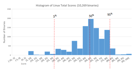
The data we're sharing first is the data from what we refer to as our static analysis. (Fuzzing and dynamic analysis data will be described later). This is the part of our data that is most similar to nutritional facts of software, as it focuses on features and contents of the binary. In particular, what application armoring features are present (and how well were they done), how complex is it, and what does the developer hygiene look like? Each binary gets a "local score", based on just that binary, and a "library score", based on the local scores for all libraries it depends on (directly or indirectly, through other libraries). These two values are combined to produce the total score. The charts below show histograms of the total scores for each of the tested environments.
We have static analysis data on the base installs on all 3 of our initial desktop environments: OSX (El Capitan 10.11), Windows 10, and Ubuntu Linux (16.04 LTS). Since it had come to our attention as an interesting test case, these installs also include Anaconda, the big data analytics package from Continuum. It's important to note that scores don't compare directly between environments. If the 50th percentile mark for Windows is higher than the one for Linux, for example, that doesn't necessarily mean anything. Each environment has different sets of safety features available and different hazards for programmers to avoid, so the score values aren't apples to apples. This is important enough to bear repeating: consumers should compare the ratings we will be releasing of applications against each other *within* a particular environment. What we're focusing on here is the overall distribution and range of scores, as this tells us something about how consistent the development process was for that operating system/environment. So which company appears to have the better Security Development Life Cycle (SDLC) process for their base OS?
We're still finalizing some data before we share reports or scores for specific software verticals, but we can share the overall landscape in each environment. In a near-future blog post we'll add call-outs for specific applications to these charts, allowing comparisons between competing projects. For now, we're just getting the lay of the land. First off, here's the histogram of application scores for the base installation of OSX.


